top of page


What We Achieved with This Project
We created a brand that brings a more human perspective to the real estate experience.
Instead of focusing solely on properties, Serena puts people, their stories, and the meaning behind each decision at the center of the brand. The identity was designed to communicate trust, warmth, and confidence while moving away from the cold, transactional language traditionally associated with real estate.
The result is a brand that feels approachable and personal, while still communicating the professionalism and expertise clients expect when making one of the biggest decisions of their lives.


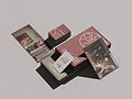
Why We Chose This Aesthetic Direction
We wanted Serena to feel like a real estate brand, without looking like every other real estate brand.
The visual direction moves away from the conventional language of the industry (generic houses, rigid typography, and overly corporate aesthetics) and instead embraces a warmer, more editorial approach.
Soft forms, an approachable visual language, and a carefully considered typographic system help create a brand that feels contemporary and trustworthy without losing its human side.
The goal was to make Serena feel less like a company selling properties and more like a partner helping people find a place to call home.


Why This Brand Works
Serena's visual identity is built around the idea that buying a property is never just a financial transaction.
A home can represent independence, family, a new beginning, an investment, or a long-awaited dream. By putting those human motivations at the center of the brand, Serena can connect with its audience on an emotional level while still maintaining the credibility expected from a real estate company.
The identity creates a balance between warmth and professionalism, allowing Serena to stand out in a traditionally impersonal industry without compromising trust.

bottom of page